Statement of Intent
My theme is Low Light and I am going to be showing my theme in the images I plan to take, I will show my work using galleries that show a journey of my work, how I got to my final gallery, my steps and my thinking throughout my entire exam. I aim for my website to be a demonstration of my work and everything I have done to get to my final gallery in the end.
For my research I plan on researching 'Low Light' photographers but mostly street photography because this is what I aim to do overall. The three photographers I am planning on researching are Liam Wong, Bill Schwab and Guy Edwardes, this is because I really like their images and how they set them out, they really draw my eye to it and makes me want to look further in. The reason why I chose Liam Wong is because it really interests me how he uses colours to make his image look better especially the neon pinks and blues he uses. I want to use it as inspiration for my own work to make them look better overall with the same style and context. I also want to look at the photographer, Bill Schwab because I find it really interesting how from only his pictures, he creates a serene and peaceful tone. The reason why I chose my other photographer, Guy Edwardes is quite similar to the reasoning behind choosing Bill Schwab, he somehow manages to create a sense of tranquility from his photos which is what I intend to do.
My first thought about this theme was just taking pictures in dark rooms or places where there is little to no light, but after looking at the exam paper again and researching the photographers, I realized that I could go down so many routes with the theme of 'Low Light'. I started looking into some pictures from Low Light photographers and was really curious about night street photography it stood out to me and I knew that is the route that I wanted to go down. I knew that with this theme I wouldn't want to have any indoor shoots and would like to keep it all outdoor.
I want to start by getting some good photos outside of school, after this shoot I want to see what I need to work on exactly and from there where I want to go forward. I'm gonna see the shoots I can try and do in school in order to get a variety of photos and a sense of what direction I want to go in next. I definitely think that most of my images are going to be outside of school because I want it to mostly be focused on low light street photography. I have a few ideas of what I want to end up with as my final gallery, so I know what is the right direction for me to go down right now at this point of my project.
Mostly throughout my project I will be using my own personal phone camera, this is because I chose the theme 'Low Light' which means most of my shoots would be outside of school anyway, and personally I believe it's simpler to get photos on my phone as I can quickly adjust the settings to get a better photo overall. However, during my in school shoots, I will be using a Canon DSLR camera to get the best outcome of photos as possible. In Photoshop, because I have the idea of colour in my photos, I'm thinking of using different colours like pink and blues so that my images really stand out and fit what I have in my head. I'm also thinking of how I could change the exposure, saturation and colour balance levels. I've thought of a tutorial that I do want to use for my final gallery that would help me add colour into the photos.
Since this is my exam, I only have a limited amount of time to do my research, photos, mood boards, and finding a tutorial before my ten hours of supervised time comes up. In order to finish everything in time, I have been sent a power point that shows the entire time I have to do everything before my exam so I can use that time specifically for photoshop. I am going to constantly go out and take photos wherever I can so that I have a variety of images in order to use for Photoshop and for my final gallery. Throughout my project I am going to show progression by presenting my first few images with my final few images and seeing the difference in the quality of my photos as you go down my page. My best images enhanced using Photoshop will be displayed in my final gallery at the end of my project.
As I move forward with my project I will constantly write down my ideas after a few shoots, thinking of where I need to go next and what needs to be done so that I can easily reflect on my work and know my next steps. I'll constantly ask for feedback from my peers and my teachers so that I can have a wider range of ideas of my work so that I know what I need to do next. I aim to push myself to new levels so that I am constantly challenged and have done the best work I could possibly do. For my photoshop, I can ask my tutors for help on new photoshops and I'll have Youtube to find new tutorials for my images, to help develop my skills and my knowledge.
Mind Map

Mood Boards


Liam Wong

Context
"Back in 2014, Scotland-born photographer Liam Wong spent time travelling as an art director for a video game company. To document his trips and show his family what he was up to, he began taking photos on his smartphone. Now an internationally celebrated photographer, Liam's vivid, contrast-filled cityscapes of Tokyo at night have amassed millions of views online and his crowdfunded book TO:KY:OO has sold out three times. Here, he discusses the inspiration behind the project and how he used the Canon EOS 5D Mark IV to capture Japan's capital after dark. Initially photography was only a hobby for Liam, but in 2015 he bought his first DSLR, a Canon EOS 5D Mark III, the predecessor to the Canon EOS 5D Mark IV. After watching Miguel Santana's Memories of Tokyo, a cinematic journey through the city in spring, Liam was inspired both technically and creatively. "It motivated me," he recalls. "I thought, 'Wow, I want to achieve that someday.'" While in Tokyo for business, Liam began shooting and sharing whatever he came across. He upgraded to a Canon EOS 5D Mark IV, and as his experience and online following grew, he noticed which subjects resonated most with viewers and refined his work into a series of vibrant night-time cityscapes – neon-filled, high-contrast images that capture the city's atmosphere through its architecture, style and people." - https://www.canon-europe.com/pro/stories/liam-wong-tokyo-cityscapes/
Composition
In the landscape image, I can see a variety of different colours which have been used to catch the viewers eyes, it draws me in and makes me want to look further into the image. There is a man in the image who seems to be covered, as if he wants his identity to remain unknown; there's writing in the back in neon colours. Most of the image is in neon pink, however, there is a neon blue room on the right lit up. The photograph must've been taken recently considering how the colours have been presented almost as if you can reach out and touch them, in order for that to have been done, a more modern camera would've been used and potentially the camera setting may have been changed to not affect the image with all the lights. It's quite obvious that the photo is an outdoor shot, considering the background. Pink is seen to be more of a warmer colour whereas on the opposite side of the spectrum is blue which is a colder colour, however, in this image I think that the colours compliment each other and contrast with the man who is mostly wearing clothes of the colours black and white. In the image, where the pink and blue mix there's shades of purple which in my opinion, makes the image stronger and makes it better overall. The image gives a sense of tranquility and peace and it makes the viewer feel calm. The first thing my eyes go to are the dramatic colours in the back; the way the man is directly in the middle makes me think that a tripod must've been used for it to have been so precise. The picture seems to have been taken at eye level, thinking of how the shop sign is so high up, to highlight the colours and accentuate them more, it's possible that Liam Wong could've used photoshop. I believe that there aren't many leading lines in the image or patterns other than the squares at the top of the image.
Connection
I believe it's quite clear that the image relates to light and how you can use different lighting to accentuate your images, the reason why this links to my work is because I chose the theme Low Light. I plan to create similar outcomes, with different colours and accentuating them in Photoshop, making my images look better overall and having my images create a sense of peace and tranquillity. I think that the photographer has executed this very well, as the image conveys the essence of peace and tranquillity through an image with different light being used, without messing with any natural element. I also intend to focus on the different lights throughout my work and this image has definitely inspired me to take images in such a way that all components of the image need attention, not just the subject.
Comment
I personally believe this is a very strong image with many prominent qualities, I think it lures you in and makes you want to dive deeper into the image, the image itself seems like it's out of an action movie. The aspect of the image that I am most fond of is how the images are meant to contrast each other but compliment each other so well and the man stood in the middle is almost like a barrier between the two colours that are like soldiers from a battle, spreading out to conquer more and more of the image. There aren't as many colours, however, the pink, blue and black there is compliment each other ultimately. Overall, I believe that this is a very powerful image that has been composed in an outstanding way and I enjoy viewing this image. The message that it could potentially be conveying, but what I believe, is that it only take a small person to stop a battle from falling out which is represented by the man showing both colours and either side of him.
Bill Schwab

Context
"Bill Schwab’s career as a photographer and publisher now spans over 4 decades with work in many private, corporate and museum collections around the world. He has been a pioneer in the area of online representation and branding of his photographic art having successfully managed a worldwide collector base for many years as well as consulted with other artists and galleries on the subject. In addition to his work as a photographer, through his North Light Photographic Workshops, he facilitates classes in several photographic process a year at his northern Michigan facility as well as leads expeditions of photographers to Iceland, the Faroe Islands and more. Bill is also founder and host of the "Photostock Festival", an annual gathering of photographers, collectors and enthusiasts for workshops, reviews, presentations and demos. In 2005 he founded North Light Press with the intention of independently supporting and publishing the work of emerging as well as established photographers and has published several successful titles to date. Recently launched under his North Light Press label is a new series titled the “11+1 Signature Series”, a series of small run, limited edition books that contain 11 reproductions and 1 original print. Each case bound book is signed and numbered by the photographer in an edition of only 100." - http://www.billschwab.com/biography/
Composition
In my opinion, I believe this landscape image gives a sense of melancholy and tranquillity, it's an outdoor shot where I can clearly see that only natural light has been used and nothing man-made. There's houses on either side of the street, some rubbish in front of one of the houses, trees surrounding most of the roads almost like a barrier, it's quite misty and foggy and looking further into the fog makes the image seem like it's from a fairy-tale or a movie with different effects that have been used to create a mysterious setting. The houses on the left look abandoned, there are some broken windows and walls. This photo has been taken from an eye level view, it's like you're looking straight ahead, I think this image has a has a deep depth of field as you can see a long way back and it’s all in focus.
In my opinion, I think that there are leading lines on both sides of the street, leading into the mist, like a path. I don't think that rule of thirds have been used but it's definitely been composed so that the picture is directly in the middle, with the houses on either side. I think Photoshop could've been used to enhance the photo further, accentuating the image. The photo has been taken at night so there is minimal lighting, the only light that is being given out is from the streetlights on the sides of the streets. I think that photoshop could potentially have been used to enhance the features of the photos more and make the photo's overall outcome more appealing, I personally believe the ISO and WB was most likely on auto so that it was easier on the photographer to have taken the photo.
In my opinion, I think that there are leading lines on both sides of the street, leading into the mist, like a path. I don't think that rule of thirds have been used but it's definitely been composed so that the picture is directly in the middle, with the houses on either side. I think Photoshop could've been used to enhance the photo further, accentuating the image. The photo has been taken at night so there is minimal lighting, the only light that is being given out is from the streetlights on the sides of the streets. I think that photoshop could potentially have been used to enhance the features of the photos more and make the photo's overall outcome more appealing, I personally believe the ISO and WB was most likely on auto so that it was easier on the photographer to have taken the photo.
Connection
I will use this research to develop my work, because it gives me an idea of how I want my images to come out, what I want my final outcomes to look like, I aspire for my images to look similar to this. Schwab does use the idea of Low Light but I personally my images would have more of a peaceful tone rather than a fantasy horror tone like Schwab has created. I intend to take photographs like this but with my own twist and a personal touch with each one.
Comment
I personally believe this image has many strong qualities, I especially like how the streets lead up to the distance, in the distance all that is seen in the fog almost like how you go for something not knowing what's gonna be in the future, what you're gonna have to face next in your journey. The image is really simple, a image that can be easily retaken just by going outside and that's what, in my opinion, makes the image a lot better, it has a sense of tranquility and peace.
Guy Edwardes

Context
"Guy Edwardes an internationally acclaimed professional landscape and nature photographer for over 25 years. Guy's career began straight after graduating from a Degree in photography, following various courses studying nature conservation. Based in Dorchester, England his passion is to capture the beauty of the natural world in the best light and the most atmospheric conditions possible. His images are marketed worldwide by several leading photographic agencies, including Nature PL and. He also manages his own library of over 250,000 images. Guy’s work has been published by a wide variety of advertising and editorial clients around the globe. Quoted as saying “Wherever I’m working I try to capture atmosphere and drama in my images. I also try to capture subjects in new ways, often working on new techniques in order to produce a unique image. Living in South West England I have a variety of beautiful landscapes and interesting habitats right on my doorstep and many of my most successful images have been taken right here". Guy's professional work takes him to some of the world’s most spectacular landscape and wildlife locations, such as; Costa Rica, Ecuador, Iceland, Africa and many countries in Europe. Guy will be introducing us to his forthcoming presentations where he will be explaining many of the techniques that he uses for capturing atmospheric and engaging images of the natural world – both landscape and wildlife. He will speak about how he plans a shoot to increase his chances of success and will show some of the equipment he uses, explaining how it benefits his photography and including examples of field-based techniques." - https://www.photographyexperts.com/webinars/An-Introduction-to-Guy-Edwardes
Composition
This landscape picture comprises of an ocean that spreads to the right of the image and a rough ocean side that is towards the left after the rocks. The absence of people or other animals of that like makes the location seem fairly lonely, yet the usage of dark blue, blacks and white does not give it a melancholy tone; on the contrary, it gives me the impression that it is a calm spot. As the water extends farther to the right, it changes tone from white froth to darker blue. Furthermore, there is a lighthouse somewhere far off that, given its separation from the rough shore which makes more evident, the lighthouse in the distance on the left is on a sweet spot, making it the most important aspect of the image. This shot clearly makes use of the rule of thirds. Due to the clear capture of the foamy effect of the water closer to the viewer, which most likely would require the use of a modern camera to capture as it is a more complex subject compared to older cameras which do not focus on such details, the photograph appears to be fairly recent and has been taken on an advanced piece of technology. The image contains a decent amount of colour, but there isn't much variety because water is mostly a darker blue, the rock formations are greyish black, and the sky is occasionally white in some places, however, it seems to be mostly dark blue and grey. A considerably darker shade of blue and shades of grey in the left-hand corner of the sky give it a bleaker appearance, which completely contrasts the image's serene mood. The photographer may have used a slow shutter speed to make the rushing water look smooth, which greatly contrasts the blackish/grey colour of the rocks but also the colour of the water further back in the image, which is a light blue. The shoreline and surrounding area appear to curve around the sea in the distance, creating additional leading lines.
Connection
I think this image strongly links to my theme on Low Light, the way the light reflects on it, I can easily go down to the northern part of England and get picture like this to add on my website, it seems as if the photo has been edited a bit to make it look more appealing, so according to that I would try get pictures as best as I can. This image fits in with my work as the base images I have taken use similar features like strong leading lines and vanishing points in the landscape and other features like rule of thirds, colour and contrast that make effective images without any or very little editing required. I will use this picture as a main inspiration for my work and will try and get the pictures I will take to a standard just as good or higher level then this one by using and incorporating techniques and skills like rule of thirds, sweet spots and vanishing points and taking into account time of year and time of day. Using these skills and techniques should produce me outstanding outcomes and pictures which I can further edit in photoshop to become much more effective and high level read for my final gallery.
Comment
I believe that this is a very strong image with many qualities that has been professionally taken. I like this image because of the good use of rule of thirds and effective strong leading lines the us of a vanishing point and the way Guy Edwardes has use the different colours in the sky and water and positioned the camera correctly to make the perfect reflection in the water which fills the image with colour. I think the image is very good as it is very eye catching with the bright colours, bold features and nice clear foreground, mid ground and background in the image.
Shoot Plan 1
|
My theme is Low Light and I am going to start by taking photos around Manchester, I don't need a model for this, as I am going to be going around taking photos of the Landscape. For my props, I'm just going to be using my phone as this is a shoot outside of school, so my equipment is just going to be my phone camera. The time of day is around the afternoon, just hitting sunset and when it starts to become dark as it relates to low light. This is going to be an independent shoot outside of school as I want to have a variety and my camera setting on my phone are most likely just going to automatically adjust. During this trip, I went to Trafford Centre, I didn't get to take proper pictures overall and on my next trip I intend to get some better photos.
|

|
Pictures


Tutorial

|
PhotoshopI've decided to use Photoshop to make these images darker so that they flow in my galleries, my theme is Low Light and I want the images to be more on the darker side, focusing more on Night time to using the darkness to reflect peace and tranquillity, so I think overall it would be better if I went to this place again or went to a different place to get some more images but when it gets more darker so it links quite clearly to my mood board, researches and mind maps.
|
|
Steps |


Original
|
Final
|
Steps |


Shoot 2
|
I decided to take some more pictures like this in a school and change them into night so that there's a better starting point and from this I know where I need to go next and my starting point moving forwards, my next steps. I can easily get daytime photos in school and then use Photoshop to change the day from night, after looking at the photos I'd had gotten, I realised my work looked similar to that of Idris Khan, however, I still had a mindset of getting pictures like my mind map and mood board focusing on the darker side.
|

|
Pictures


Photoshop

|

|
Steps
|
|
My first thought with this image was to just change the background by filter gallery, adding a moonlight filter on. However, I went on Photoshop and started to mess around with the Vibrance, colour balance, saturation and exposure and I came out with an image that I really liked, it reflected on the darkness in the night whereas focusing on a blue night more. The thing I like the most is that there is a hint of light even though most of the picture is dark, it draws your eyes to the light and the reflection. |


Reflecting on my photos, I believe they do look quite interesting, however, I still don't think it quite relates to my mood board and my initial thoughts. I want to focus more on the darker side and try different techniques within Photoshop rather than a quite simple method of changing the sky to blue and adjusting it.
Shoot Plan 1
|
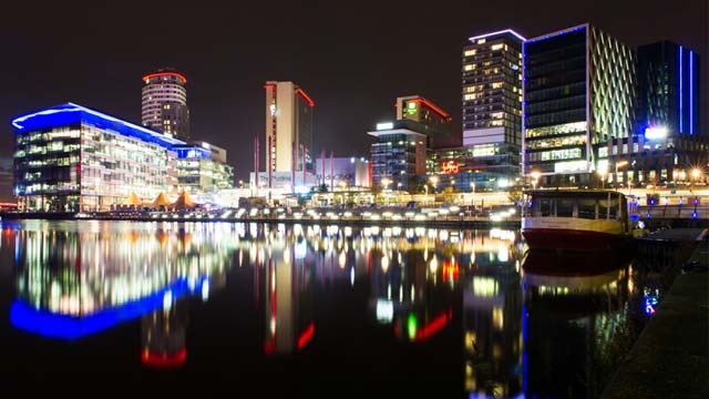
I intend to go down to Salford quays and get some photos to add to my exam, the reason why I am doing this is because I chose the theme Low Light, this means I would have to do it outside of school. The equipment I am going to use is my phone camera as I wasn't able to get my camera out. As my theme is Low Light, I've decided to go down at night so that the images I get actually match with my theme. However, there was some artificial light coming from the building but I think that would just make the image look better overall.
|
|
Pictures


Best and Worst

|
I think this is my best image because I really like how most of the picture is dark it's giving an atmosphere of peace and tranquillity, however, the small amounts of colours in the corners almost brightens up the image and makes the image look better.
|
This is my worst photo because overall it's blurry, I obviously didn't focus the camera before taking the photo and the lighting is quite bright with there also being no main focus of the actual image in my opinion. I could've slightly changed the angle to get a better photo.
|
Shoot Plan 2
|
With this shoot, I took it in school in our drama theatre, this was kind of an experiment to see what I could do within school. I used my phone camera because I thought of the different settings I could use on my phone whilst taking the photo and also afterwards. I'm going to completely darken most of the room and keep a bit of light only so that I could get better pictures.
For this, I wanted to experiment and see what indoor shoots I could potentially get focusing on the theme of 'Low Light' and colour that I want incorporated into my photos. |

|
Pictures


Best and Worst


|
In my opinion, I think that this is my best picture from this shoot, because I really like how the only light coming is from the room upstairs, the rest of the room is dark and it overall makes the light more significant.
|
I don't like this photo because I feel like it's quite irrelevant and has no clear link to my work, it's just an image of chairs whereas I want to work on lights and the effect it can have.
|
Shoot Plan 3
|
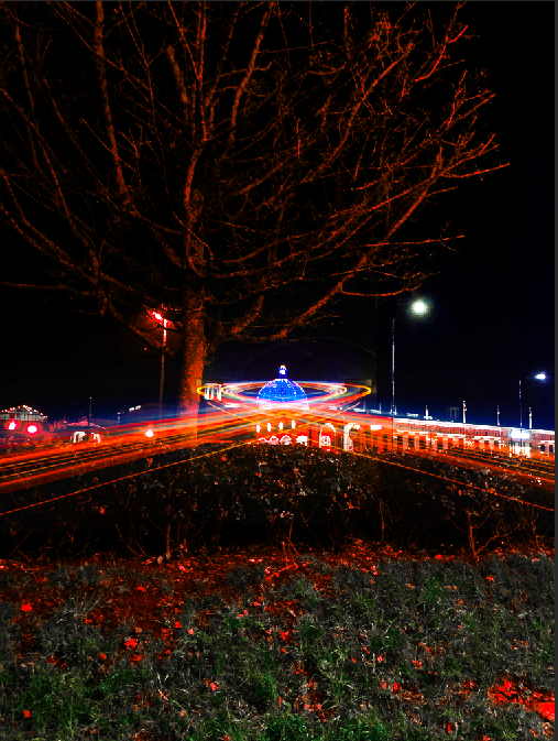
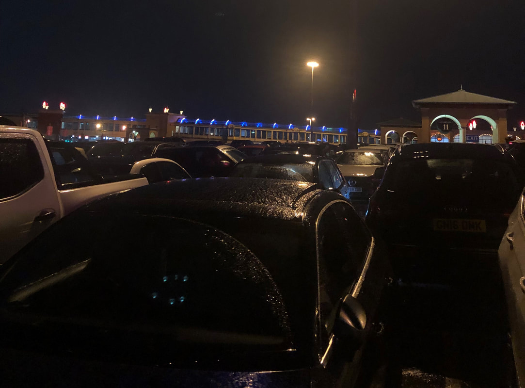
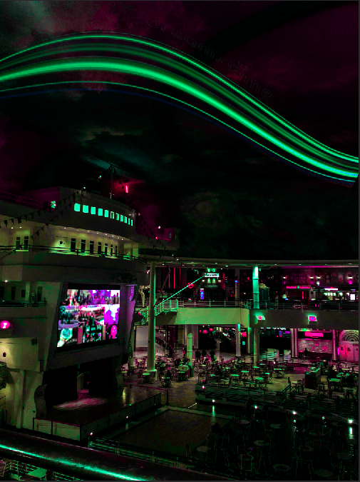
For this shoot, I decided to go out to Trafford Centre because I feel like it's a place where I can get many photos relating to my theme of 'Low Light'. I'm currently doing dark images with colour in some places and I think I could get pictures like that at Trafford Centre at night. For this shoot, I definitely want to try and capture the street and splashes of light wherever I can. The equipment that I will be using is my own phone camera and because that's all I need to take photos I'll be able to get around more and get as many photos as possible. The lighting created for my shoot will be purely natural from street lights or ceiling lights, however, if needed I will use the flash on my phone. Since this shoot is purely landscape, I won't need any models or anything of the sort, and for composition I think I'm just going to try get some landscape horizontal images of the street or inside the Trafford Centre.
|

|

|
Pictures


Best and Worst
|
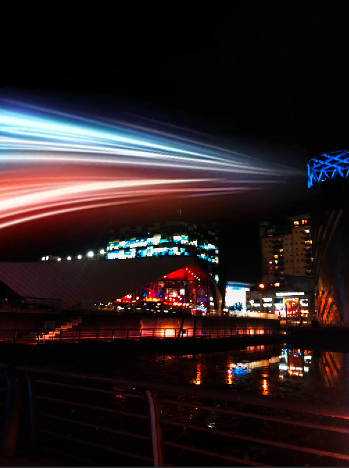
This is my best image from this shoot because I really like how the light of the dome stands out and contrasts overall with the darkness, how the rest of the image is black it gives a calming peaceful tone.
|
I think this is not a very good image because the main focus seems a bit too far and how the sign is included into the photo, to make it better I could crop it down so that the sign is taken out of the image.
|


Best and Worst
|
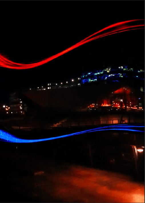
I think this is my best photo because I really like how the photo mainly focuses on the blue lights, I feel like this closely connects to my research of the photographer Liam Wong because of the colours that are associated with the photos he takes.
|
This is a good image overall, but I think that it hasn't quite been composed correctly, I held my phone quite tilted which cause the image to come out bent and not straight which completely just ruins the image.
|


Best and Worst

|
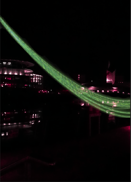
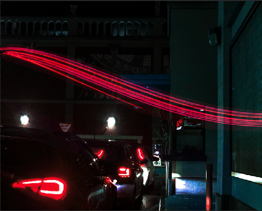
I think this is my best photo because I really like how there's little to no light and it makes the lights on the screen stand out a lot more and overall accentuate the image. This quite clearly links to my mood board of 'Low Light', to do this I tapped on the image on my phone and lowered the brightness so I could have it link clearly.
|
This is a bad image because I've not thought about the composition correctly, the pictures are too blurry and crowded. It should've been higher up not including the people at the bottom, so it ruins all the images. I could've made this better by thinking about how the image would come out.
|

|
|
Steps
|
|
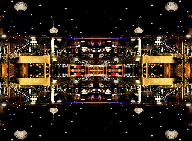
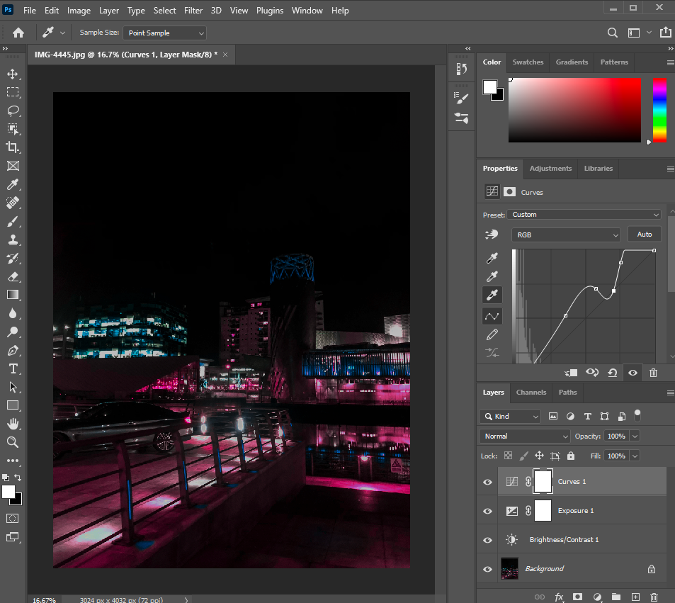
First, I opened two images that I wanted on top of each other, then I unlocked the background and dragged the second picture on top of the first and lowered the opacity. Afterwards, I cropped the image down to the main area where the light was coming from and made a kaleidoscope effect by duplicating the layer vertically and horizontally. I then decided to mess with the image by changing the vibrance, exposure, gamma correction and made the image more lighter and brighter. I also increased the contrast so that there was more of a contrast between the variety of colours in the image. |


I reflected on my photos and I decided to try a different Photoshop technique for my final gallery as the outcomes I had come out with was quite similar to my Texture outcomes and I wanted to go down a different route, I want to try a different creative technique just to see how my outcomes come out.

|

|
Steps
|
|
For this image, from the start I decided I wanted to go down a different route and I just played around by using the camera raw filter, using this I first of all adjusted the settings of the color mixer by decreasing the red fully, changing the aquas to 81, blue to 4, purple to -55 and magenta to 73. Then, I went to the basic setting and changed the contrast and highlight to -50, the shadows to 37, the whites to 58 and blacks to 39, the clarity to 24, vibrance to 13 and saturation to -4. I went on the curve and made the line quite curved towards the ends. Then I went on color mixer again but this time went on saturation and changed the red to -11, orange to -100, green to 4, aquas to 16, blues to 19, purples to 75, magentas to 2. I changed the detail settings from sharpening to 60. I went to the calibration settings and changed the red primary hue to -100, the green primary hue to 100 and the blue primary hue to -100. I pressed ok and went on normal settings and adjusted the brightness and contrast to my liking and also changed the exposure and gamma correction, I adjusted the curves too.
|


Going further
|
|
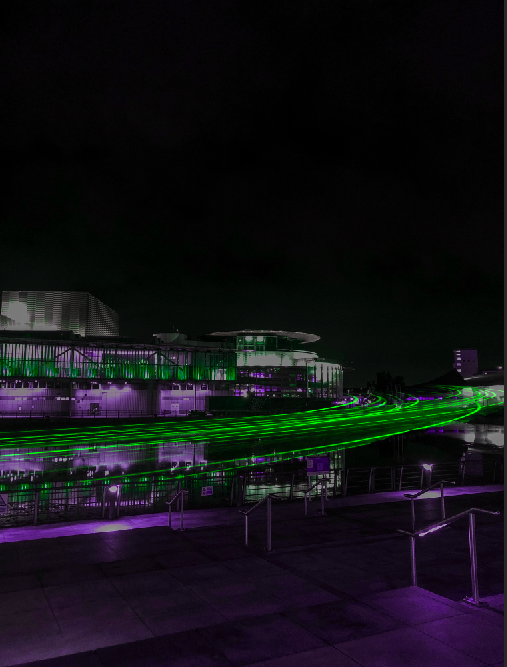
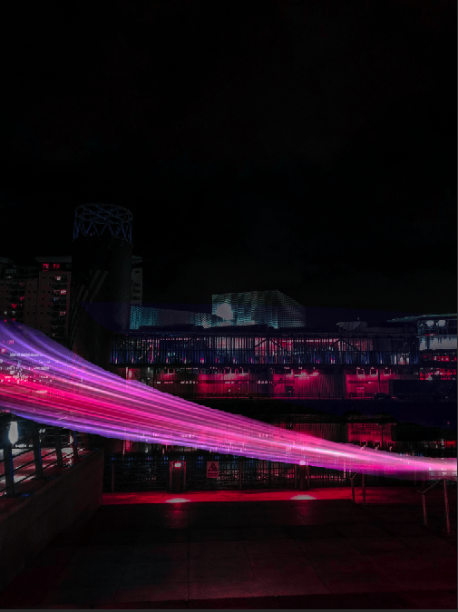
I went further with this photo by adding a light trail on I did this first by finding the trail I wanted on google and opened it in photoshop along with the photo I wanted it on and I changed the layer kind from normal to screen and this made the image blend in, then I erased the white bits out so that only the trail was shown and I warped and distorted the image until it looked the way I wanted it to. |


Final Image

After this image, I decided I wanted to have a bit of a change, I did this by changing the colours as I didn't want all of my images being the same neon pink as it would've become quite repetitive, so I changed the saturation and hue afterwards to get different images and overall have more outcomes.
Evaluation
My main theme was Low Light and explored the different types such as dark rooms with beams of light, evening pictures and street night photography. Overall, my favourite theme was street night photography, I really enjoyed this specific theme because I was able to get out and get images whereas for my other pages most of my images were taken in school and more of indoor shoots. This theme really made me think what I wanted with my final outcome using Photoshop and it helped improve my knowledge and skills further than what I already had.
Personally, in this project, I found the use of Photoshop the most interesting because not only could I could reflect on the properties of my photos but I was also able to manipulate it and improve it by relating it further to my mood boards and to my initial thoughts on this project. Not just Photoshop, I also really enjoyed getting to go out on location and getting different photos so that my overall project just became better.
For this project, I used most of the techniques I had learned from other projects in the past such as building my page and setting up my gallery. Most of my Photoshop was learnt from a tutorial and I believe it was quite interesting to learn how to improve this skill. First, finding a tutorial to add a cyberpunk effect and then going further with that by adding light trails. The tools that I used were changing the camera raw filter, adjusting different properties and settings.
If I were able to develop a technique further, I would choose to develop a lot more of my skills in Photoshop such as using different filters and after that adjusting exposure, gamma correction and the saturation to improve my images more. If I was to do the next project, I would choose to play with lighting and see how I can get different photos.
I researched 'Low Light' photographers but mostly street photography because this is what I had in mind from the start of my project. The three photographers that I researched are Liam Wong, Bill Schwab and Guy Edwardes, this is because I really like their images and how they set them out, they really draw my eye to it and makes me want to look further in. The reason why I chose Liam Wong is because it really interests me how he uses colours to make his image look better especially the neon pinks and blues he uses. I also looked at the photographer, Bill Schwab because I find it really interesting how from only his pictures, he creates a serene and peaceful tone. The reason why I chose my other photographer, Guy Edwardes is quite similar to the reasoning behind choosing Bill Schwab, he somehow manages to create a sense of tranquillity from his photos.
I personally believe that they influenced my photos in quite a positive way as using their photos as inspiration I had motivation to improve my photos further. Bill Schwab and Guy Edwardes have a similar tone emitting from their photos of peace and a serene landscape which is what I intended to do and I think I managed to achieve that before editing my photos in Photoshop. After moderation of my photos I believe my images heavily link to Liam Wong with the neon colours and dark settings, having a play with light.
In my opinion, for this project I really enjoyed Photoshop, the technique specifically that I enjoyed was creating a cyberpunk look onto my photos as I had never done something like this, exploring what different features did to my images and how to improve them. I think that this gave me a really good outcome and it grew my confidence in my images for my exam. It also made me want to explore this topic in the future.
I definitely think that the most successful part of my project was the different Photoshop technique I learnt because it was different to all of my other projects. I also really enjoyed the outcomes I managed to create at the end as I feel like they round off the project relating to Low Light quite well. The shoot I most enjoyed was my Salford Quays shoot as I was able to get so many more images which really improved my work.
This year I feel I was able to do a lot more compared to the past year because of the after effects of the Covid pandemic, I was able to go out on many location shoots, however, I feel that I had little motivation because of the stress and pressure on myself to go out and actually be able to enjoy the pictures I was able to take, and overall have a good experience with this project. I really enjoyed doing Photoshop as I believe it allowed me to fully reflect on my images and learn what made it better.
The techniques I learnt from watching tutorials on Youtube really helped and getting help from other peers when needed to get feedback, it also really helped having someone who had experience, my teacher, to advise me and give me feedback. The tutorials especially helped my photos become hoe they turned out as I hit a bit of a barrier towards the final part of my project and was unsure where to go next, at this point, I watched many tutorials to figure out where to go next and reflected on my galleries.
If I was given the chance to complete the project again, I personally would be more organized by managing my time so that I was able to get some more images to get some more outcomes and improve the overall look of my page. Another thing I would do is experiment more with different types of Low Light as I feel that I didn't use everything I could with this project. It would've been more beneficial if I was able to go ahead with my drawing with light in the darkness idea as I could've showed more of a journey.
21st April, in my first exam I will not add anymore information or make any changes to the work above.
Exam

|
|
|
|
This was my first attempt of trying this technique with a different colour by changing the saturation, I think it is a quite interesting look and it doesn't seem as repetitive as it would if I was doing just neon pink and blue as the main theme. |


|

|


|
|


|
|


|

|
|
|
I believe that this photo has very strong qualities, the best part is how the light trail just fits perfectly around the dome and just completes the image. |


|
|


|
|


|
|

|
|


|
|


Final Gallery